For centuries, the map hanging in classrooms from Accra to Nairobi to Lusaka has told African children a quiet lie about their own continent: that it is roughly the same size as Greenland, a fraction of the size of Russia, and comparable to Europe. Today, that lie has a name, a resolution number, and a recorded vote at the United Nations.
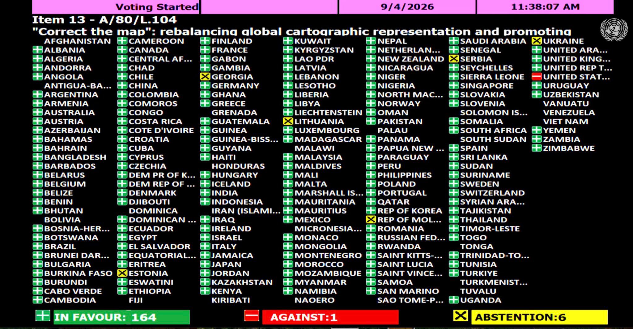
On Friday, September 4, 2026, the UN General Assembly adopted resolution A/80/L.104, titled "Correct the Map," by a vote of 164 in favor, 1 against, and 6 abstaining. The resolution was introduced by Togo on behalf of the African Group and supported by the African Union. The United States cast the lone vote against the measure, while Estonia, Georgia, Lithuania, the Republic of Moldova, Serbia, and Ukraine abstained. Every other UN member state present — from Algeria to Zimbabwe, and including major European powers such as France, Germany, and the United Kingdom — voted in favor.
It is a milestone moment for a campaign that African governments, geographers, and educators have pushed for years: an official, multilateral acknowledgment that the way the world has drawn itself has never been neutral, and that Africa has paid the price for it.
What the Resolution Actually Does
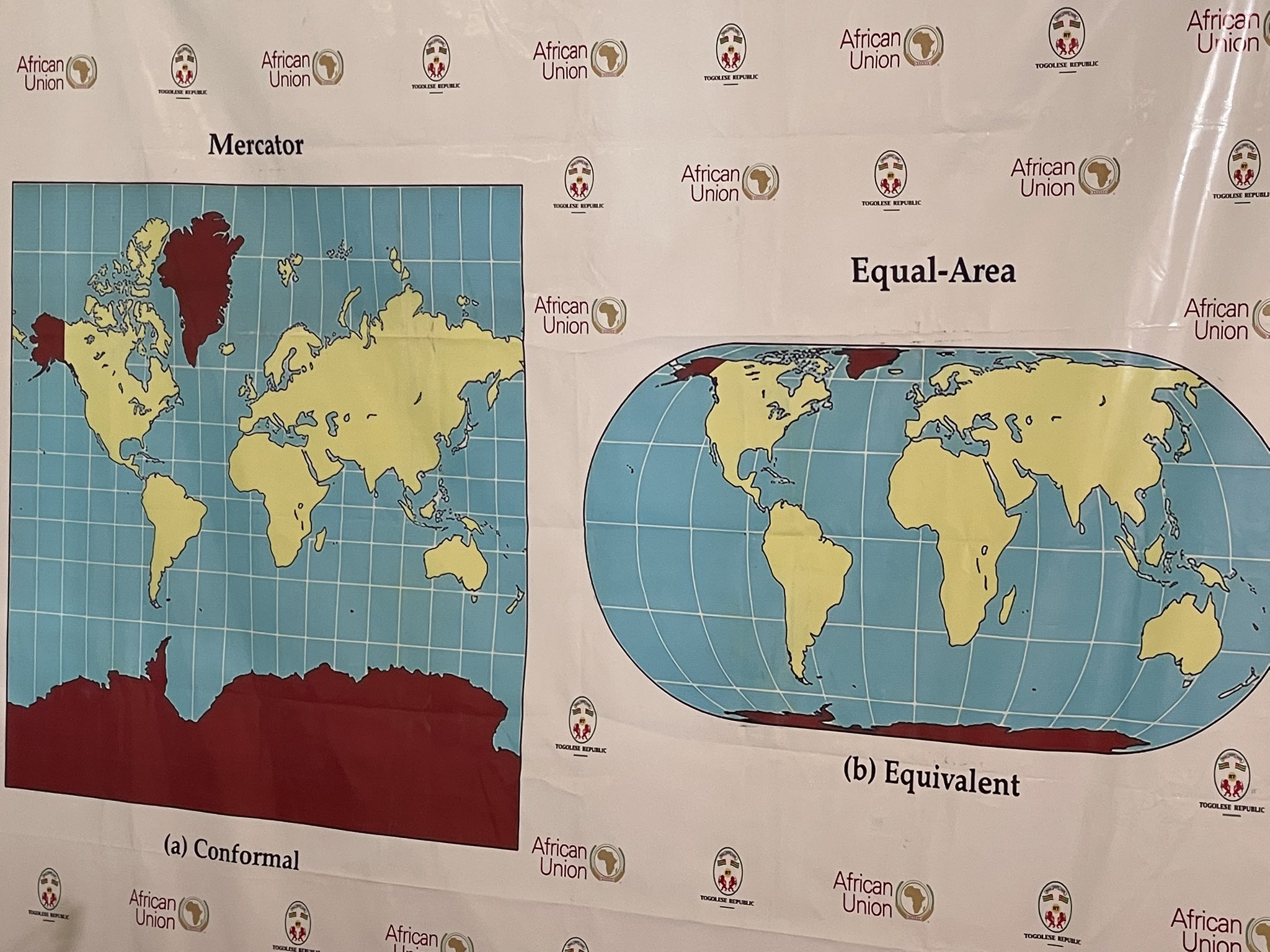
The resolution promotes the use of equal-area map projections, including Equal Earth, so that maps better reflect the true dimensions of continents and correct the distortions long associated with the Mercator projection. It first won backing from the African Union Assembly in February 2026 before being formally taken up and passed at the United Nations.
Importantly, the resolution is not a binding legal mandate. It does not compel any country or institution to abandon the Mercator projection, which remains one of the most widely used maps in the world. Even so, observers note the vote is expected to influence the maps used by educational systems, media organizations, and international institutions going forward. In other words: this is a moral and diplomatic marker, not a court order — but it is one now carrying the weight of near-unanimous global endorsement.
Togo's Foreign Minister, Robert Dussey, who led the charge on behalf of the African Group, put the case simply and directly before the vote: "A fair world begins with a fair map." He argued that maps do far more than mark borders — they shape education, feed the imagination, and quietly influence how people perceive the world around them.
The resolution found support well beyond Africa. France's foreign minister, Jean-Noël Barrot, backed the initiative and indicated France would stop relying on the Mercator map. That is a notable statement from a former colonial power whose own national outline benefits, more than almost any other country's, from the exact distortion the resolution seeks to correct.
Not every delegation was convinced. The lone dissenting vote came from the United States delegation, whose representative argued that the General Assembly should be focused on matters of international peace, prosperity, and good relations rather than debating map projections, characterizing the whole exercise as a distraction. Whatever one makes of that objection, it was not shared by a single other country in the chamber — 164 nations, including many of the world's wealthiest and most powerful, judged that correcting the map was worth doing.
The Deception the Resolution Is Correcting
To understand why 164 countries just went on record over what might sound, on its surface, like an abstract technical issue, it helps to look at the actual numbers.
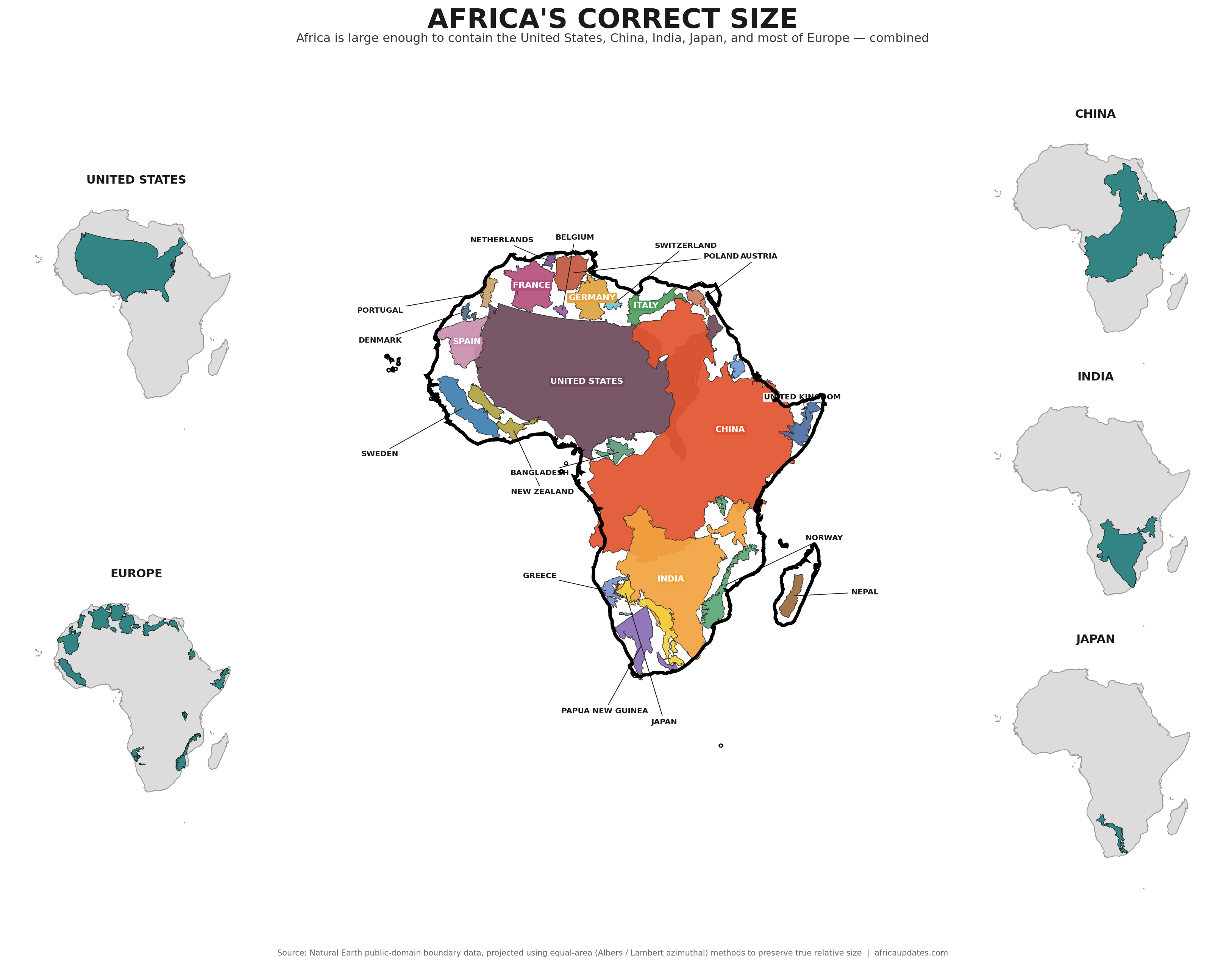
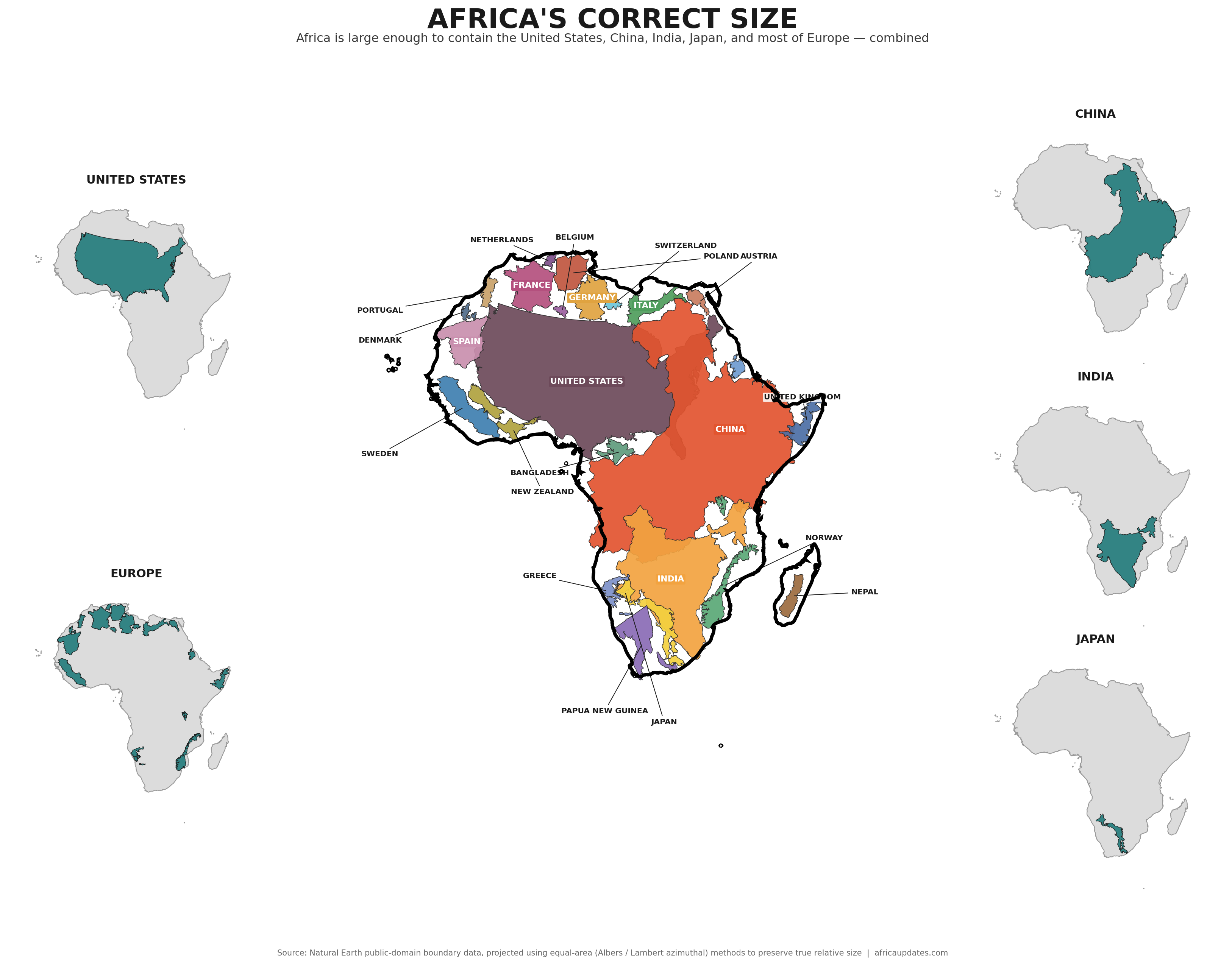
Africa's true land area is approximately 30.37 million square kilometers (11.7 million square miles). To grasp what that means, consider what fits inside a landmass that size: the United States, China, India, Mexico, France, Spain, Germany, Japan, the United Kingdom, Italy, Norway, Sweden, New Zealand, Nepal, Bangladesh, and Greece — combined — still would not cover the whole of the continent. The United States and China together account for roughly 64% of Africa's area on their own; add India, and the total climbs to nearly three-quarters, with room still to spare.
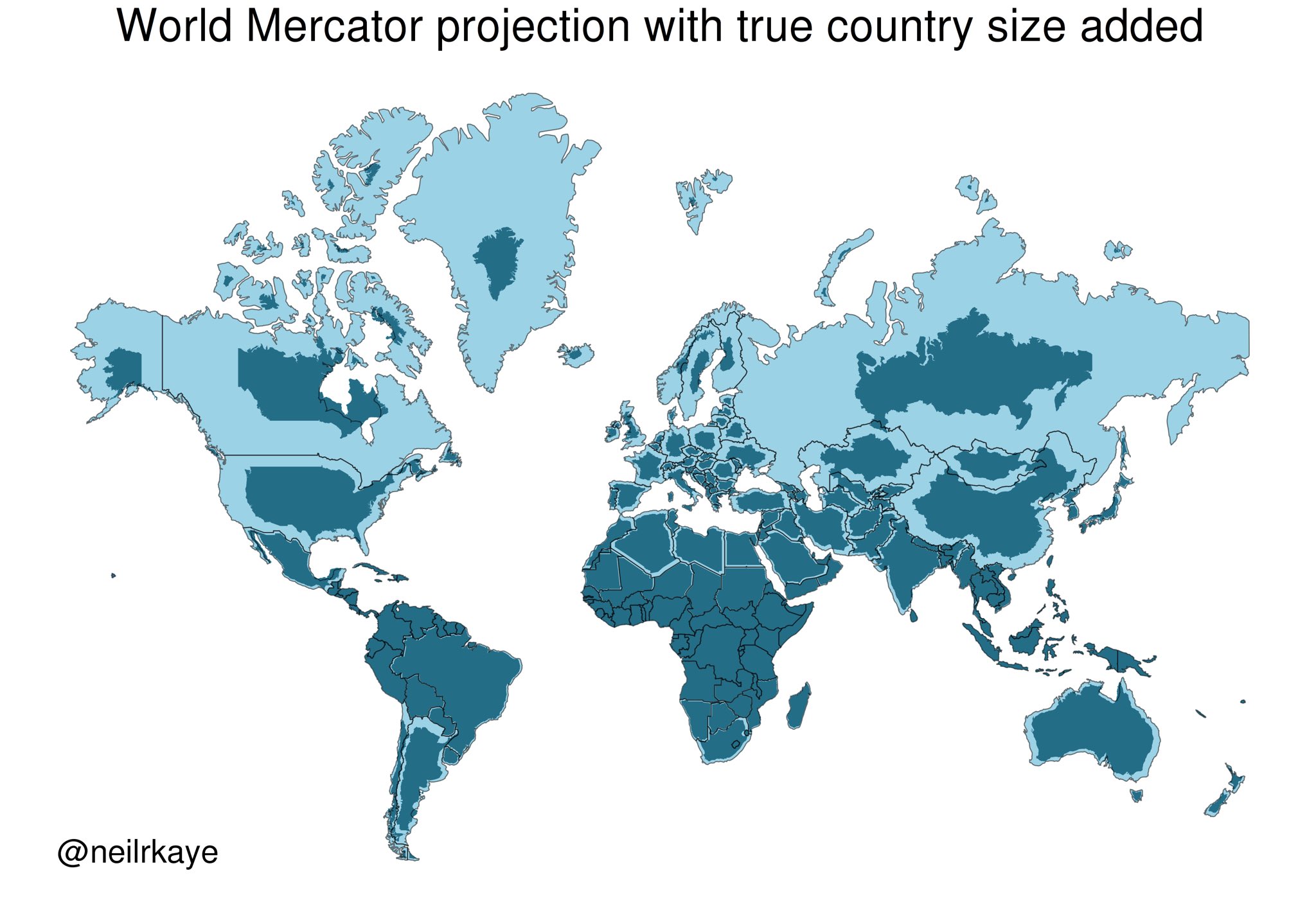
Africa is roughly 14 times larger than Greenland — yet on the standard Mercator-based map most of the world grew up with, the two look almost identical in size. Africa is home to 54 countries and roughly 1.2 billion people, spanning deserts, rainforests, savannahs, and river systems on a scale that rarely comes through in the map most people actually see.
This is not a harmless artistic quirk. It is a distortion with a specific history, a specific origin, and a specific cost — one that Africa has been paying for more than four centuries.
A Navigation Tool Built for Sailors, Inherited by Empires
The projection responsible for this distortion was designed in 1569 by the Flemish cartographer Gerardus Mercator to help European explorers navigate the world. It solved a real 16th-century problem: letting sailors plot straight compass courses across a curved planet. But solving that problem came at a cost. Rendering a spherical Earth on a flat surface inevitably distorts something, and the Mercator method distorts the relative size of landmasses. Regions near the poles are inflated far beyond their true size; regions near the equator — including nearly all of Africa — stay closer to their actual proportions.
The problem was never really the map's original purpose. The problem is what happened afterward: European colonial powers adopted the Mercator projection as the default way of depicting the world, and it became the map reproduced in atlases, newspapers, and classrooms across the colonized world, Africa very much included. A tool built to solve a 16th-century navigation problem became the default visual grammar of empire — and empire had every incentive to keep circulating a map that made the colonizing continent look imposing and the colonized continent look modest.
More than six decades after the end of formal colonial rule across most of the continent, that same map has remained the default nearly everywhere — until this week.
Colonialism of the Mind
Independence movements across Africa fought to remove foreign flags, foreign administrators, and foreign armies. But a map does not come down in a ceremony. It hangs quietly on classroom walls and lives inside geography textbooks and search-engine results, shaping the mental image every new generation of students forms of their own place in the world.
When African children are taught, implicitly, year after year, that their continent is roughly Greenland-sized — while Europe, a landmass a small fraction of Africa's true size, is shown as equal or greater — it does something subtle but corrosive to a young person's sense of scale and significance. It is a quiet, constant signal, repeated in classrooms and on screens for a lifetime, that Africa is the periphery and Europe is the center. That is not a neutral cartographic accident; it is a psychological inheritance of colonialism that persisted long after the political structures of colonial rule were dismantled — right up until 164 nations voted this week to say, officially, that it should not persist any longer.
Correcting the map is not a symbolic gesture disconnected from real life. It sits alongside the same broader project as decolonizing curricula, restoring African place names, and teaching African history from African sources rather than only from the archives of former colonial powers. Geography is one of the first subjects children encounter, and the mental map built in a classroom at age eight can shape how a person understands power, scale, and importance for the rest of their life. This resolution gives African ministries of education, publishers, and universities a fresh, internationally endorsed mandate to make sure that map is finally honest.
There Is No Longer a Technical Excuse
For centuries, there was at least a practical argument for sticking with Mercator: alternative projections were harder to calculate, harder to print, and less familiar to readers. That argument does not survive contact with 2026 technology, and the resolution itself leans on this point.
Modern mapping software, satellite data, and computing power make it entirely possible to render the Earth's landmasses at their true relative proportions instantly, interactively, and at almost no additional cost. Equal-area projections such as Equal Earth — a projection specifically designed to represent surface areas proportionally while preserving a visually balanced view of the globe — already exist, are freely available, and solve the size-distortion problem directly. So do the Gall–Peters projection and Japan's AuthaGraph model. Interactive tools that let users compare countries' true sizes by dragging them across a globe have existed publicly for years and require nothing more than a browser.
Given this, it is difficult to justify why the world's largest mapping companies, search engines, weather services, and educational publishers have continued to default to a projection that cartographers have acknowledged for decades is misleading. The technology to do better is not a research project, and it is not expensive or complicated — it is a design choice. Continuing to default to Mercator as the invisible backdrop of global visual culture, without at least offering an accurate alternative, keeps distorting how billions of people perceive the relative size and importance of nations and continents. If a smartphone can render a photorealistic 3D globe in real time, there is no remaining technical reason a weather app, a news graphic, or a school atlas cannot default to a projection that shows Africa, South America, and the rest of the Global South at their true size.
An Honest Map Is a Matter of Basic Respect
There is a difference between an imperfect compromise and a systematic distortion that always flatters the same handful of wealthy, historically colonizing nations while always shrinking the same handful of historically colonized ones. Every flat map of a round Earth involves some trade-off — that much is true and always will be. But it is not a coincidence that the trade-off the world settled on, and kept using for 450 years, happens to inflate Europe and North America while shrinking Africa, South America, and South Asia. That pattern was never a neutral accident of mathematics. It was a legacy that went unexamined for far too long — until this week's vote at the UN forced the question onto the world's agenda.
Presenting Europe as visually comparable in size to Africa, when the real difference is enormous, is not a small rounding error. It shapes how students, policymakers, investors, and casual map-readers everywhere subconsciously rank the relative scale and significance of continents. For a continent of 1.2 billion people, spanning a land area larger than the United States, China, and India put together, to be persistently visualized as an afterthought was never just inaccurate — it was a quiet, repeated act of disrespect. This week, for the first time, the international community said so on the record.
What Happens Next
The African Union has signaled this is only the beginning of implementation, not the end of the campaign. In a communiqué following the vote, the Chairperson of the African Union Commission, Mahmoud Ali Youssouf, welcomed the resolution and credited Togo's leadership, along with that of Togolese President Faure Essozimna Gnassingbé, for mobilizing broad international support. The Commission said it will continue working with Togo, AU member states, and international partners to help turn the resolution's aims into practice — encouraging international institutions, educational systems, publishers, and digital platforms to progressively adopt cartographic representations that more accurately reflect actual land areas.
Concretely, that means the campaign now shifts to implementation across a few key fronts:
- African ministries of education now have an internationally endorsed mandate to require equal-area or true-size map projections in national geography curricula and textbooks, rather than defaulting to whatever atlas publisher supplies the cheapest Mercator-based product.
- African media houses and publishers, including outlets like Africa Updates, can commit to using accurate-area maps in their own graphics and reporting, setting an editorial standard rather than reproducing inherited templates.
- Global mapping and technology companies — the firms behind the search engines, weather apps, and productivity software billions of people use daily — now face direct diplomatic pressure, backed by 164 UN member states, to offer true-size or equal-area projections as a default or a prominent, easy-to-select option rather than a buried setting.
- African universities and cartography departments can use the momentum of this vote to lead research and public-awareness campaigns on map literacy, helping the public understand exactly how and why standard maps distort the continent.
- African Union member states, collectively, now have a passed UN resolution to point to in follow-up engagement with international mapping standards bodies and major technology firms.
None of these steps require new technology to be invented. They require institutions to follow through on what 164 governments just agreed was overdue.
The Bottom Line
Africa does not need to be made bigger. It already is big — big enough to swallow the United States, China, India, and a dozen European nations inside its borders and still have room left over, and roughly 14 times the size of the Greenland it has so often been visually mistaken for. What Africa needed was for the rest of the world, and its own students, to finally be shown that truth on the map, rather than the four-and-a-half-century-old distortion that made the continent look like an afterthought next to a much smaller Europe.
This week, that need was formally recognized by the United Nations General Assembly. The resolution will not, by itself, rewrite the economic and political imbalances left behind by colonialism, and it carries no binding force. But it removes, symbolically and diplomatically, one more quiet signal that told generations of African children their homeland was smaller and less significant than it has ever actually been — and it does so with the backing of 164 nations against a single dissenting vote. In an age of satellite imagery and instant digital rendering, there was never a remaining excuse — technical, financial, or otherwise — for the map to keep lying. On September 4, 2026, the world's governments finally said so out loud.
Sources: United Nations General Assembly voting record for resolution A/80/L.104, "Correct the Map" (September 4, 2026); African Union Commission communiqué following the resolution's adoption; reporting from NPR, Voice of Nigeria, and Afrik.com; historical and comparative land-area data on Africa's size, including analysis previously published by Visual Capitalist